


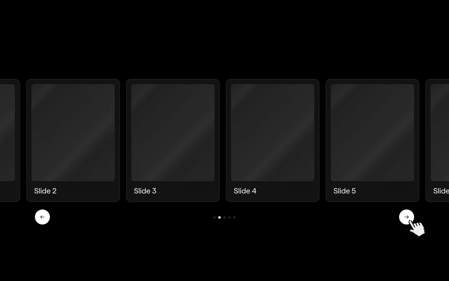
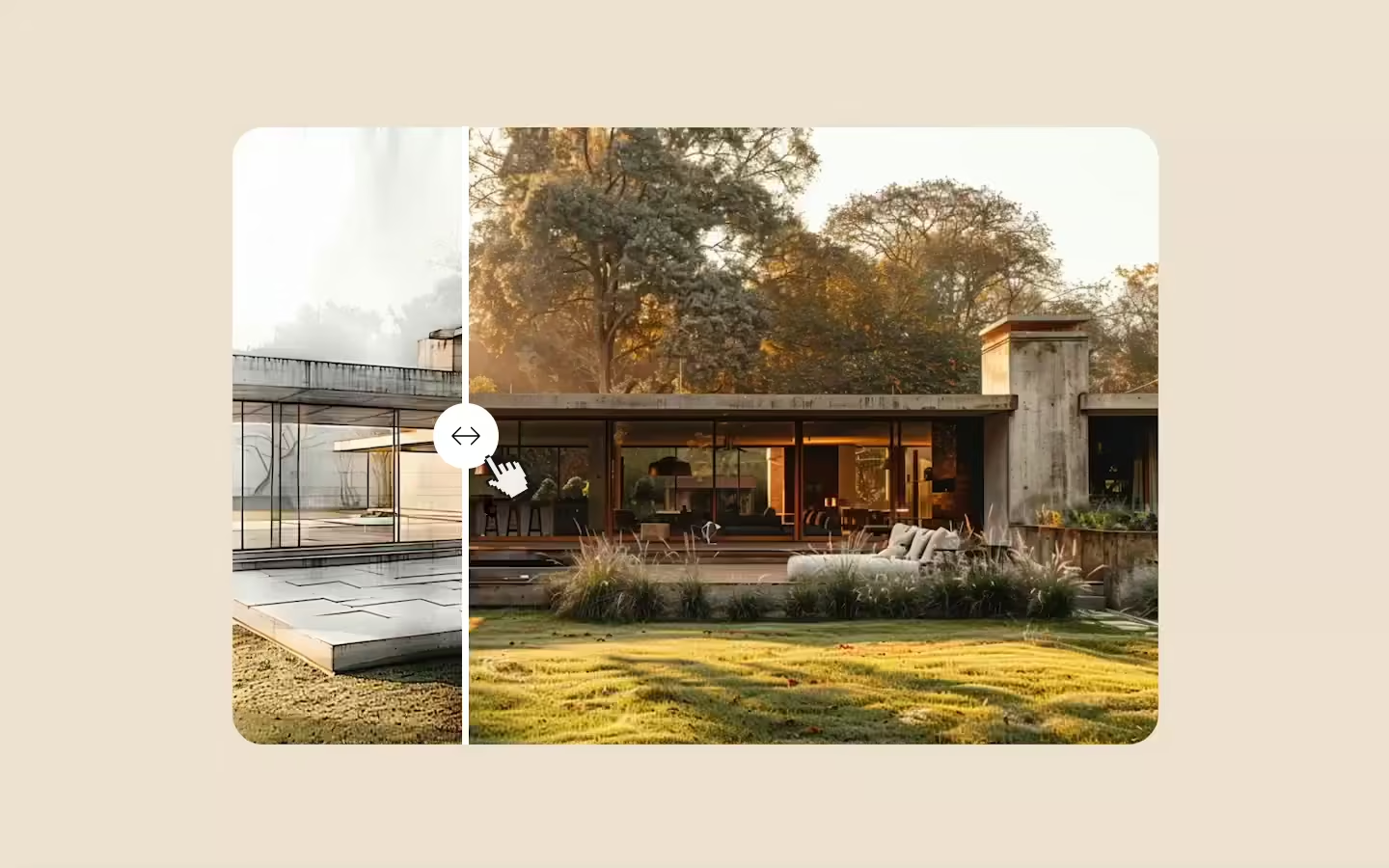
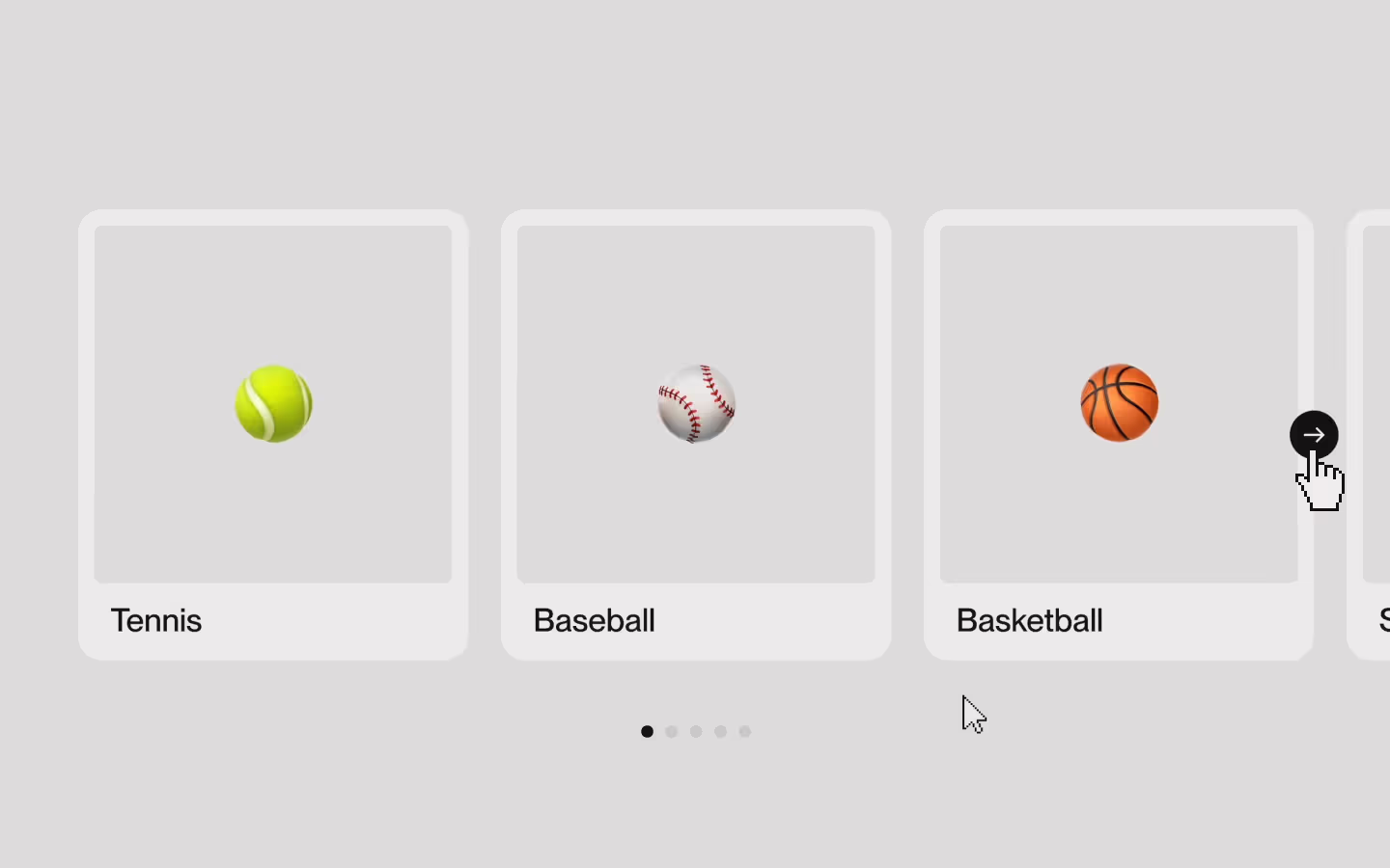
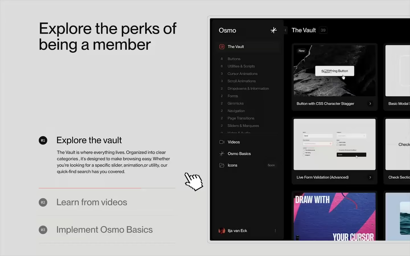
Horizontal Scrolling Sections

Documentation
Webflow
Code
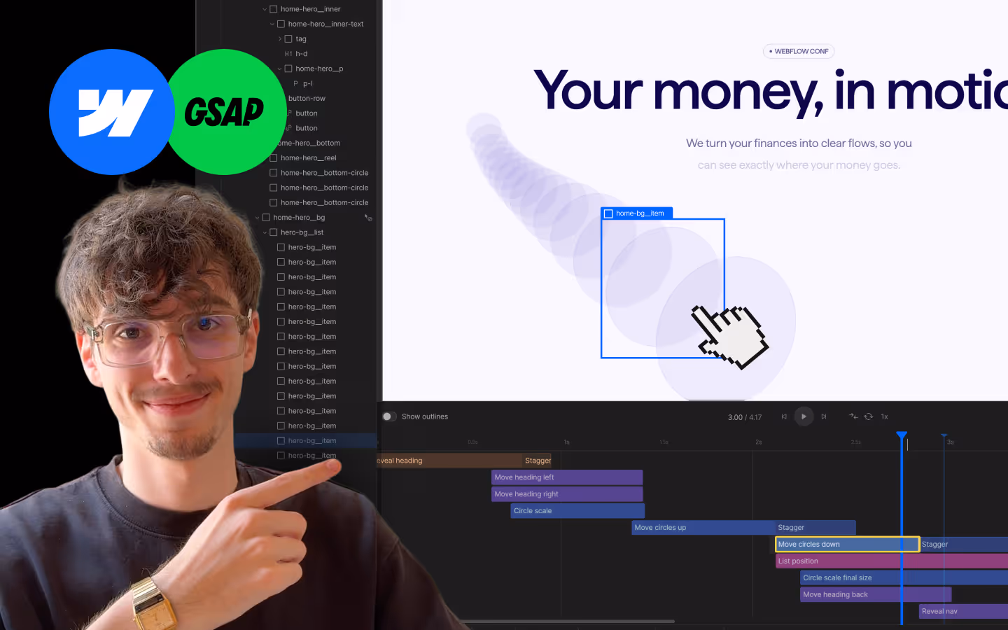
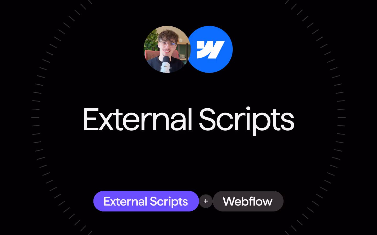
Setup: External Scripts
External Scripts in Webflow
Make sure to always put the External Scripts before the Javascript step of the resource.
In this video you learn where to put these in your Webflow project? Or how to include a paid GSAP Club plugin in your project?
HTML
<script src="https://cdn.jsdelivr.net/npm/gsap@3.13.0/dist/gsap.min.js"></script>
<script src="https://cdn.jsdelivr.net/npm/gsap@3.13.0/dist/ScrollTrigger.min.js"></script>
Step 1: Copy structure to Webflow
Copy structure to Webflow
In the video below we described how you can copy + paste the structure of this resource to your Webflow project.
Copy to Webflow
Webflow structure is not required for this resource.
Step 1: Add HTML
HTML
<section class="horizontal__wrap" data-horizontal-scroll-wrap data-horizontal-scroll-disable="mobileLandscape">
<div data-horizontal-scroll-panel class="horizontal__panel">
<div class="horizontal__panel-inner">
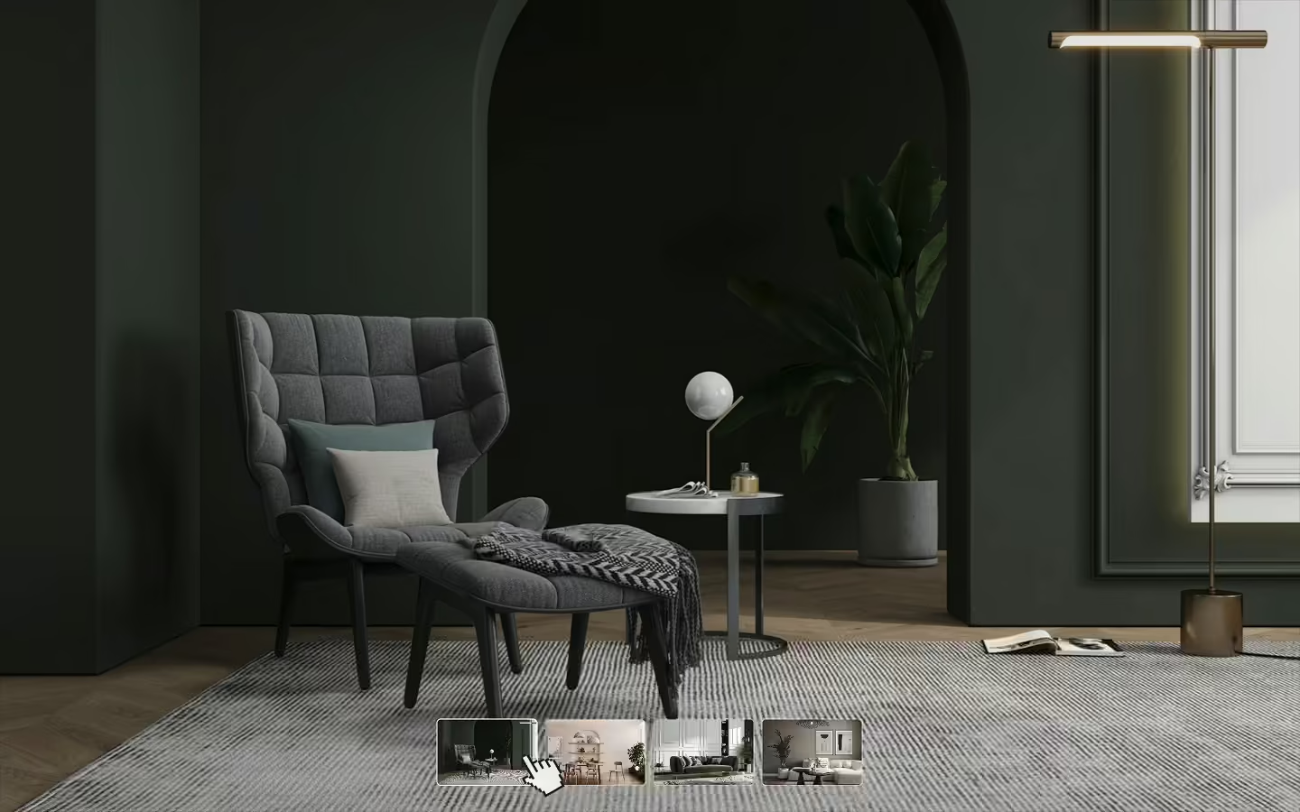
<div class="demo-card">
<div class="demo-card__bg">
<img src="https://cdn.prod.website-files.com/68f8bc9dc83dc1aacaa172e7/68f8cf7185c9dcfbedc6d4aa_Dramatic%20Mountain%20Range%20at%20Sunrise.avif" class="demo-card__bg-img">
</div>
<div class="demo-card__inner">
<h2 class="demo-header__h1">Dolomites</h2>
</div>
</div>
</div>
</div>
<div data-horizontal-scroll-panel class="horizontal__panel">
<div class="horizontal__panel-inner">
<div class="demo-card">
<div class="demo-card__bg">
<img src="https://cdn.prod.website-files.com/68f8bc9dc83dc1aacaa172e7/68f8cf71364a2fdf36e25d26_Tranquil%20Dawn%20over%20the%20Pastel%20Peak%20Range.avif" class="demo-card__bg-img">
</div>
<div class="demo-card__inner">
<h2 class="demo-header__h1">Patagonia</h2>
</div>
</div>
</div>
</div>
<div data-horizontal-scroll-panel class="horizontal__panel">
<div class="horizontal__panel-inner">
<div class="demo-card">
<div class="demo-card__bg">
<img src="https://cdn.prod.website-files.com/68f8bc9dc83dc1aacaa172e7/68f8cf712f57198f963fd7eb_Majestic%20Mountain%20Landscape.avif" class="demo-card__bg-img">
</div>
<div class="demo-card__inner">
<h2 class="demo-header__h1">Yosemite Park</h2>
</div>
</div>
</div>
</div>
<div data-horizontal-scroll-panel class="horizontal__panel">
<div class="horizontal__panel-inner">
<div class="demo-card">
<div class="demo-card__bg">
<img src="https://cdn.prod.website-files.com/68f8bc9dc83dc1aacaa172e7/68f8cf71cb5249dc6ea2eb35_Subdued%20Mountain%20Serenity.avif" class="demo-card__bg-img">
</div>
<div class="demo-card__inner">
<h2 class="demo-header__h1">Pyrenees</h2>
</div>
</div>
</div>
</div>
</section>HTML structure is not required for this resource.
Step 2: Add CSS
CSS
.demo-header__h1 {
  letter-spacing: -.04em;
  margin-top: 0;
  margin-bottom: 0;
  font-size: 4em;
  font-weight: 500;
  line-height: .95;
}

.horizontal__wrap {
  flex-flow: row;
  min-height: 100dvh;
  display: flex;
  overflow: hidden;
}

.horizontal__panel {
  flex: none;
  width: 100%;
}

.horizontal__panel-inner {
  width: 100%;
  height: 100%;
  padding: 1.25em;
}

.demo-card {
  border-radius: 1.25em;
  flex-flow: column;
  justify-content: flex-end;
  align-items: flex-start;
  width: 100%;
  height: 100%;
  padding: 3em;
  display: flex;
  position: relative;
  overflow: hidden;
}

.demo-card__bg {
  z-index: 0;
  position: absolute;
  inset: 0%;
}

.demo-card__inner {
  z-index: 1;
  position: relative;
}

.demo-card__bg-img {
  object-fit: cover;
  width: 100%;
  height: 100%;
}

@media screen and (max-width: 767px) {
  .demo-header__h1 {
    font-size: 2.5em;
  }

  .horizontal__wrap {
    flex-flow: column;
  }

  .horizontal__panel {
    height: 30em;
  }

  .demo-card {
    padding: 1.25em;
  }
}
Step 2: Add custom Javascript
Custom Javascript in Webflow
In this video, Ilja gives you some guidance about using JavaScript in Webflow:
Step 2: Add Javascript
Step 3: Add Javascript
Javascript
function initHorizontalScrolling() {
  const mm = gsap.matchMedia();

  mm.add(
    {
      isMobile: "(max-width:479px)",
      isMobileLandscape: "(max-width:767px)",
      isTablet: "(max-width:991px)",
      isDesktop: "(min-width:992px)"
    },
    (context) => {
      const { isMobile, isMobileLandscape, isTablet } = context.conditions;

      const ctx = gsap.context(() => {
        const wrappers = document.querySelectorAll("[data-horizontal-scroll-wrap]");
        if (!wrappers.length) return;

        wrappers.forEach((wrap) => {
          // optional disable logic per breakpoint
          const disable = wrap.getAttribute("data-horizontal-scroll-disable");
          if (
            (disable === "mobile" && isMobile) ||
            (disable === "mobileLandscape" && isMobileLandscape) ||
            (disable === "tablet" && isTablet)
          ) {
            return; // skip this wrapper on specified breakpoint
          }

          const panels = gsap.utils.toArray("[data-horizontal-scroll-panel]", wrap);
          if (panels.length < 2) return;

          gsap.to(panels, {
            x: () => -(wrap.scrollWidth - window.innerWidth),
            ease: "none",
            scrollTrigger: {
              trigger: wrap,
              start: "top top",
              end: () => "+=" + (wrap.scrollWidth - window.innerWidth),
              scrub: true,
              pin: true,
              invalidateOnRefresh: true,
            },
          });
        });
      });

      return () => ctx.revert(); // cleanup
    }
  );
}

// Initialize Horizontal Scrolling Sections
document.addEventListener("DOMContentLoaded", () => {
  initHorizontalScrolling();
});
Step 3: Add custom CSS
Step 2: Add custom CSS
Custom CSS in Webflow
Curious about where to put custom CSS in Webflow? Ilja explains it in the below video:
CSS
/* Add auto overflow in webflow to make editing easier */
.wf-design-mode [data-horizontal-scroll-wrap] {
  overflow: auto;
}
Implementation
Make sure you are not using display: flex; or overflow: hidden; on the parent of your [data-horizontal-scroll-wrap], this will break the resource. For most users this is the <body> or <main> element.
Wrapper
Use [data-horizontal-scroll-wrap] on the section that contains all horizontally scrolling panels. This wrapper defines the scrollable area and is pinned while the panels move sideways during scroll. By default, the animation uses the wrapper’s full scroll width to determine how far the panels should translate.
Panels
Use [data-horizontal-scroll-panel] on each child element that should move horizontally. Each panel is translated on the X-axis as the user scrolls. You can add as many panels as you like; each will automatically be included in the scroll distance calculation. The function will only run if you have at least 2 panels inside a wrapper.
Responsive Disable
To disable the horizontal scroll behavior on specific breakpoints, add [data-horizontal-scroll-disable] with one of the following values:
"mobile"→ disables below 480px"mobileLandscape"→ disables below 768px"tablet"→ disables below 992px
When the wrapper is disabled on that breakpoint, it simply behaves like a normal section.
CSS Structure
Each panel can be flexible in its width, there's no requirement for them to be all perfectly 100vw wide. Just make sure your wrapper has a horizontal flexbox layout, and your panels are set to flex: none. This ensures they don't collapse horizontally.
ScrollTrigger Animations inside the Wrapper
Since the page isn’t actually scrolling horizontally (the wrapper itself is pinned while its panels are translated), any scroll-based animation inside a horizontally scrolling section needs to reference the same ScrollTrigger instance.
GSAP provides a clean solution for this via container animations. By linking your nested ScrollTriggers to the horizontal scroll’s container animation, they’ll sync perfectly to the simulated horizontal progress rather than the page’s vertical scroll. Read more in the official GSAP docs. Here's an example:
// main horizontal tween
const horizontalTween = gsap.to(panels, {
  x: () => -(wrap.scrollWidth - window.innerWidth),
  ease: "none",
  scrollTrigger: {
    trigger: wrap,
    start: "top top",
    end: () => "+=" + (wrap.scrollWidth - window.innerWidth),
    scrub: true,
    pin: true,
    invalidateOnRefresh: true
  }
});

// nested scroll animation
gsap.to("[data-inner-element]", {
  x: -100,
  ease: "none",
  scrollTrigger: {
    containerAnimation: horizontalTween, // tie to horizontal progress
    trigger: "[data-inner-element]",
    start: "left right",
    end: "right left",
    scrub: true
  }
});Resource details
Last updated
December 18, 2025
Category
Scroll Animations
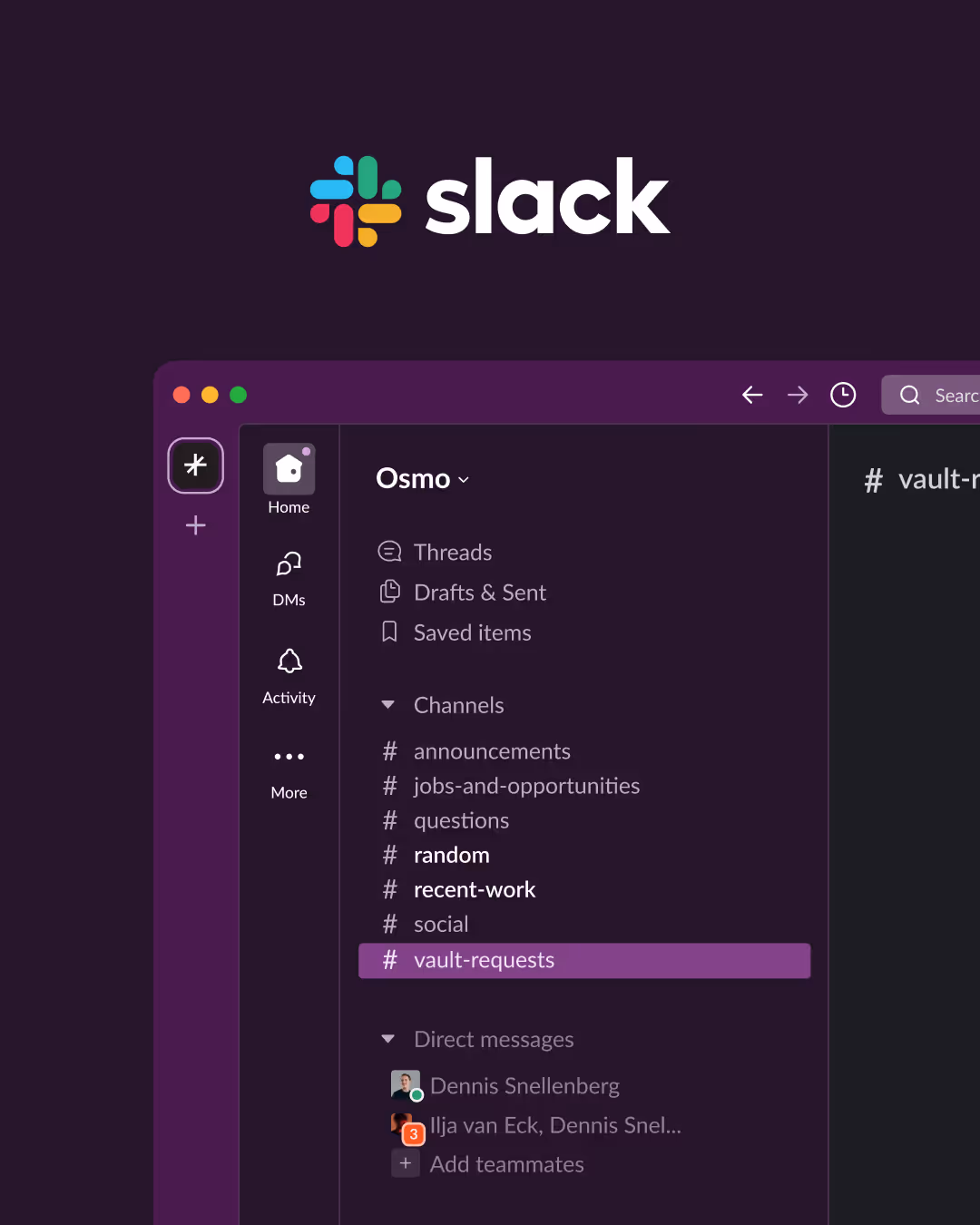
Need help?
Join Slack
Original source
 Ilja van Eck
Creator Credits
We always strive to credit creators as accurately as possible. While similar concepts might appear online, we aim to provide proper and respectful attribution.