


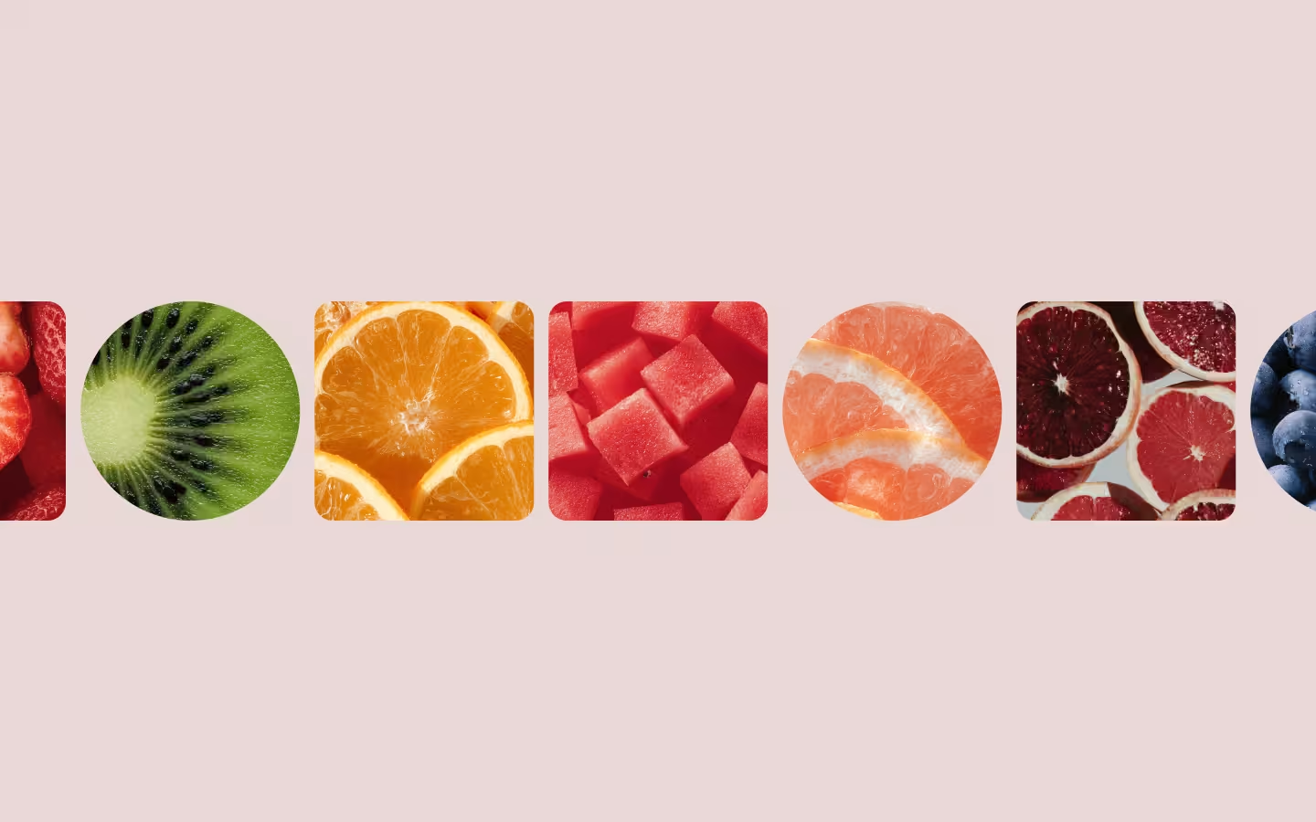
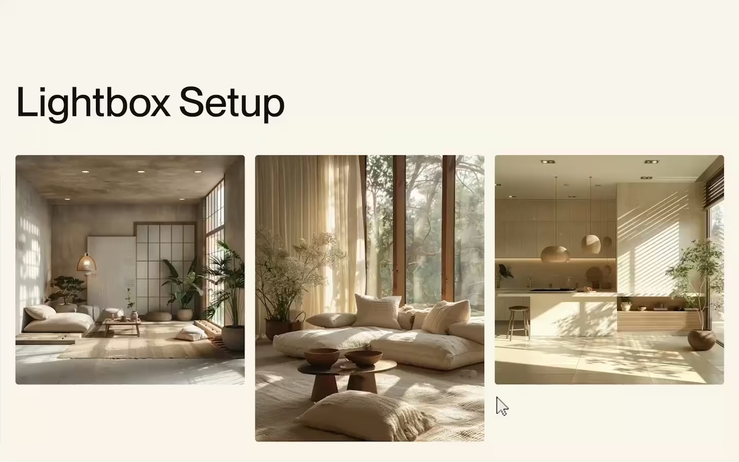
Masonry Grid

Documentation
Webflow
Code
Setup: External Scripts
External Scripts in Webflow
Make sure to always put the External Scripts before the JavasScript step of the resource. In this video you learn where to put these in your Webflow project:
HTML
Step 1: Copy structure to Webflow
Copy structure to Webflow
In the video below we described how you can copy + paste the structure of this resource to your Webflow project:
Copy to Webflow
Webflow structure is not required for this resource.
Step 1: Add HTML
HTML
<div class="masonry-wrap">
<div class="masonry-collection">
<div data-masonry-list="" class="masonry-list">
<div class="masonry-item">
<div class="masonry-item__visual">
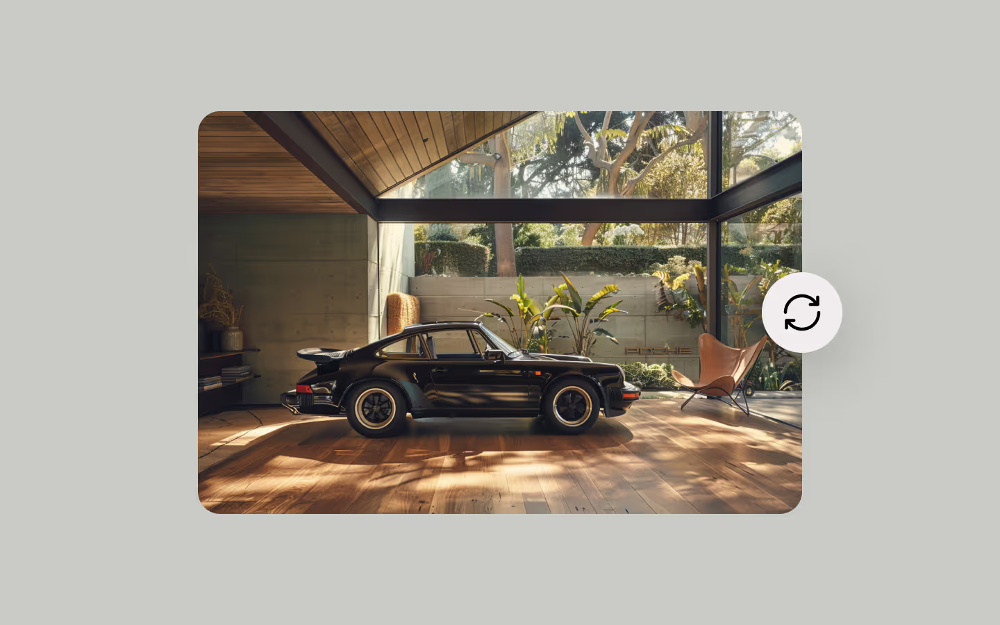
<img src="https://cdn.prod.website-files.com/688006f2c368aa3a853bab48/688008cdca559e9bd5ebd7d7_masonry-img-1.avif" class="masonry-item__visual-img">
</div>
</div>
<div class="masonry-item">
<div class="masonry-item__visual is--wide">
<img src="https://cdn.prod.website-files.com/688006f2c368aa3a853bab48/688008cdf54d6a568093e395_masonry-img-8.avif" class="masonry-item__visual-img">
</div>
</div>
<div class="masonry-item">
<div class="masonry-item__visual">
<img src="https://cdn.prod.website-files.com/688006f2c368aa3a853bab48/688008cdea9e46cc9cff02a5_masonry-img-2.avif" class="masonry-item__visual-img">
</div>
</div>
<div class="masonry-item">
<div class="masonry-item__visual is--square">
<img src="https://cdn.prod.website-files.com/688006f2c368aa3a853bab48/688008cddd1040e5b58dbc36_masonry-img-3.avif" class="masonry-item__visual-img">
</div>
</div>
<div class="masonry-item">
<div class="masonry-item__visual is--square">
<img src="https://cdn.prod.website-files.com/688006f2c368aa3a853bab48/688008cd2e50b385995fd987_masonry-img-4.avif" class="masonry-item__visual-img">
</div>
</div>
<div class="masonry-item">
<div class="masonry-item__visual is--tall">
<img src="https://cdn.prod.website-files.com/688006f2c368aa3a853bab48/688008cd7ca8630a1e6d711c_masonry-img-5.avif" class="masonry-item__visual-img">
</div>
</div>
<div class="masonry-item">
<div class="masonry-item__visual">
<img src="https://cdn.prod.website-files.com/688006f2c368aa3a853bab48/688008cd2f6c02ac20dda78d_masonry-img-6.avif" class="masonry-item__visual-img">
</div>
</div>
<div class="masonry-item">
<div class="masonry-item__visual">
<img src="https://cdn.prod.website-files.com/688006f2c368aa3a853bab48/688008cd7f801a64b787dab7_masonry-img-7.avif" class="masonry-item__visual-img">
</div>
</div>
<div class="masonry-item">
<div class="masonry-item__visual">
<img src="https://cdn.prod.website-files.com/688006f2c368aa3a853bab48/688008cd19ad8f594cbaf606_masonry-img-9.avif" class="masonry-item__visual-img">
</div>
</div>
<div class="masonry-item">
<div class="masonry-item__visual is--square">
<img src="https://cdn.prod.website-files.com/688006f2c368aa3a853bab48/688008cd60cd447d80485e3b_masonry-img-10.avif" class="masonry-item__visual-img">
</div>
</div>
<div class="masonry-item">
<div class="masonry-item__visual">
<img src="https://cdn.prod.website-files.com/688006f2c368aa3a853bab48/688008cd19ad8f594cbaf624_masonry-img-12.avif" class="masonry-item__visual-img">
</div>
</div>
<div class="masonry-item">
<div class="masonry-item__visual">
<img src="https://cdn.prod.website-files.com/688006f2c368aa3a853bab48/688008cd15fb1cab1dfa8d99_masonry-img-11.avif" class="masonry-item__visual-img">
</div>
</div>
<div class="masonry-item">
<div class="masonry-item__visual">
<img src="https://cdn.prod.website-files.com/688006f2c368aa3a853bab48/688008cdd2006fe51677421f_masonry-img-15.avif" class="masonry-item__visual-img">
</div>
</div>
<div class="masonry-item">
<div class="masonry-item__visual">
<img src="https://cdn.prod.website-files.com/688006f2c368aa3a853bab48/688008cdb52036722a27a35c_masonry-img-13.avif" class="masonry-item__visual-img">
</div>
</div>
<div class="masonry-item">
<div class="masonry-item__visual">
<img src="https://cdn.prod.website-files.com/688006f2c368aa3a853bab48/688008cdd6a1c7f361a73e0e_masonry-img-14.avif" class="masonry-item__visual-img">
</div>
</div>
</div>
</div>
</div>HTML structure is not required for this resource.
Step 2: Add CSS
CSS
.masonry-wrap {
  padding-bottom: 4em;
  padding-left: 2em;
  padding-right: 2em;
}

.masonry-list {
  grid-column-gap: var(--masonry-gap);
  grid-row-gap: var(--masonry-gap);
  flex-flow: wrap;
  justify-content: flex-start;
  align-items: flex-start;
  display: flex;
  position: relative;
}

.masonry-item {
  width: calc(((100% - 1px)  - (var(--masonry-col)  - 1) * var(--masonry-gap)) / var(--masonry-col));
}

.masonry-item__visual {
  border-radius: 1.25em;
  width: 100%;
  overflow: hidden;
}

.masonry-item__visual.is--square {
  aspect-ratio: 1;
}

.masonry-item__visual.is--wide {
  aspect-ratio: 3 / 2;
}

.masonry-item__visual.is--tall {
  aspect-ratio: 2 / 3;
}

.masonry-item__visual-img {
  object-fit: cover;
  width: 100%;
  height: 100%;
}

[data-masonry-list] {
  --masonry-col: 4;
  --masonry-gap: 1em;
}

@media screen and (max-width: 991px) {
  [data-masonry-list] {
    --masonry-col: 3;
    --masonry-gap: 1em;
  }
}

@media screen and (max-width: 767px) {
  [data-masonry-list] {
    --masonry-col: 2;
    --masonry-gap: 0.5em;
  }
}
Step 2: Add custom Javascript
Custom Javascript in Webflow
In this video, Ilja gives you some guidance about using JavaScript in Webflow:
Step 2: Add Javascript
Step 3: Add Javascript
Javascript
function initMasonryGrid() {
  document.querySelectorAll('[data-masonry-list]').forEach(container => {
    const shuffle = container.dataset.masonryShuffle !== 'false';
    let cols, gapPx, colHeights;

    // Take columns and gaps from CSS
    const getVars = () => {
      const cs = getComputedStyle(container);
      cols = parseInt(cs.getPropertyValue('--masonry-col'));
      const rawGap = cs.getPropertyValue('--masonry-gap').trim();
      if (rawGap.endsWith('px')) {
        gapPx = parseFloat(rawGap);
      } else if (rawGap.endsWith('em')) {
        gapPx = parseFloat(rawGap) * parseFloat(cs.fontSize);
      } else if (rawGap.endsWith('rem')) {
        gapPx = parseFloat(rawGap) * parseFloat(getComputedStyle(document.documentElement).fontSize);
      } else {
        gapPx = parseFloat(rawGap);
      }
    };

    // Set the layout
    const layout = () => {
      getVars();
      const wCalc = `(100% - ${(cols - 1)}*var(--masonry-gap)) / ${cols}`;
      colHeights = Array(cols).fill(0);
      container.style.position = 'relative';
      const items = Array.from(container.children);
      items.forEach(el => {
        el.style.position = 'absolute';
        el.style.width = `calc(${wCalc})`;
      });
      items.forEach((el, i) => {
        const h = el.offsetHeight;
        const idx = shuffle
          ? colHeights.indexOf(Math.min(...colHeights))
          : (i % cols);
        el.style.top  = `${colHeights[idx]}px`;
        el.style.left = `calc(${wCalc}*${idx} + var(--masonry-gap)*${idx})`;
        colHeights[idx] += h + gapPx;
      });
      container.style.height = `${Math.max(...colHeights)}px`;
    };

    // Debounce function
    const debounce = (fn, delay) => {
      let t;
      return () => {
        clearTimeout(t);
        t = setTimeout(fn, delay);
      };
    };

    // Resize handler
    const onResize = debounce(layout, 100);
    window.addEventListener('resize', onResize);

    // Watch for image loads (fallback if no aspect-ratio defined)
    const debouncedLayout = debounce(layout, 50);
    const imgLoad = () => {
      container.querySelectorAll('img').forEach(img => {
        if (!img.complete) {
          img.addEventListener('load', debouncedLayout, { once: true });
          img.addEventListener('error', debouncedLayout, { once: true });
        }
      });
    };

    // Run layout immediately, then watch for straggler images
    layout();
    imgLoad();

    // Constructor with destroy and recalc function
    container._masonry = {
      recalc: () => {
        layout();
        imgLoad();
      },
      destroy: () => {
        window.removeEventListener('resize', onResize);
        const items = Array.from(container.children);
        items.forEach(el => {
          el.style.position =
          el.style.width =
          el.style.top =
          el.style.left = '';
        });
        container.style.position =
        container.style.height = '';
      }
    };
  });
}

// Initialize Masonry Grid
document.addEventListener('DOMContentLoaded', () => {
  initMasonryGrid();
});
Step 3: Add custom CSS
Step 2: Add custom CSS
Custom CSS in Webflow
Curious about where to put custom CSS in Webflow? Ilja explains it in the below video:
CSS
[data-masonry-list] {
  --masonry-col: 4;
  --masonry-gap: 1em;
}

@media screen and (max-width: 991px) {
  [data-masonry-list] {
    --masonry-col: 3;
    --masonry-gap: 1em;
  }
}

@media screen and (max-width: 767px) {
  [data-masonry-list] {
    --masonry-col: 2;
    --masonry-gap: 0.5em;
  }
}
Implementation
Grid and columns
Add the data-masonry-list attribute on any list or grid with items inside. We'll use CSS to control the amount of columns per breakpoint, as wel as the gap between the grid items using 2 variables on our list. Our JS functions looks for these variables to make all the necessary calculations.
[data-masonry-list] {
  --masonry-col: 4; /* Control the amount of columns */
  --masonry-gap: 1em; /* The gap between all of the items */
}

@media screen and (max-width: 991px) {
  [data-masonry-list] {
    --masonry-col: 3;
    --masonry-gap: 1em;
  }
}

@media screen and (max-width: 767px) {
  [data-masonry-list] {
    --masonry-col: 2;
    --masonry-gap: 0.5em;
  }
}
Order of elements
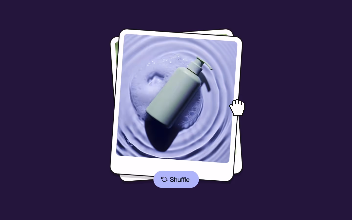
By default, the function might 'shuffle' some elements visually to create a balanced layout in terms of height. If you absolute do not want that, and you need to preserve the order in your HTML, add the data-masonry-shuffle="false" attribute to the data-masonry-list element.
Recalculate the masonry grid
In case you want to use a Masonry grid, and you're making adjustments to elements in your grid with a filter for example, you'll want to recalculate all of the positions. In that case you can call the recalc() method anywhere in your JS where you might need it like this:
// Find the grid, and then re-init the layout
const masonryGrid = document.querySelector('[data-masonry-list]');
masonryGrid._masonry.recalc();
Destroy the masonry grid
In the event you want to destroy the grid, perhaps if you're using an SPA approach like BarbaJS, we have also added a destroy() method. This removes all the inline styling and resets it to the flex-wrap look that it gets from the CSS.
// Find the grid, and then destroy the layout
const masonryGrid = document.querySelector('[data-masonry-list]');
masonryGrid._masonry.destroy();Resource details
Last updated
December 16, 2025
Category
Sections & Layouts
Need help?
Join Slack
Original source
 Ilja van Eck
Creator Credits
We always strive to credit creators as accurately as possible. While similar concepts might appear online, we aim to provide proper and respectful attribution.