


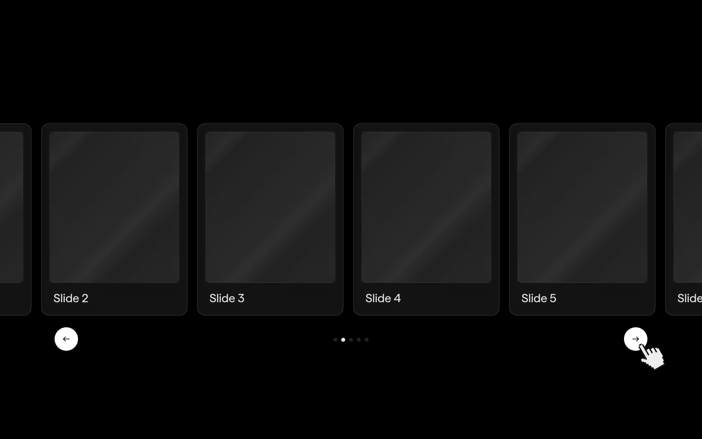
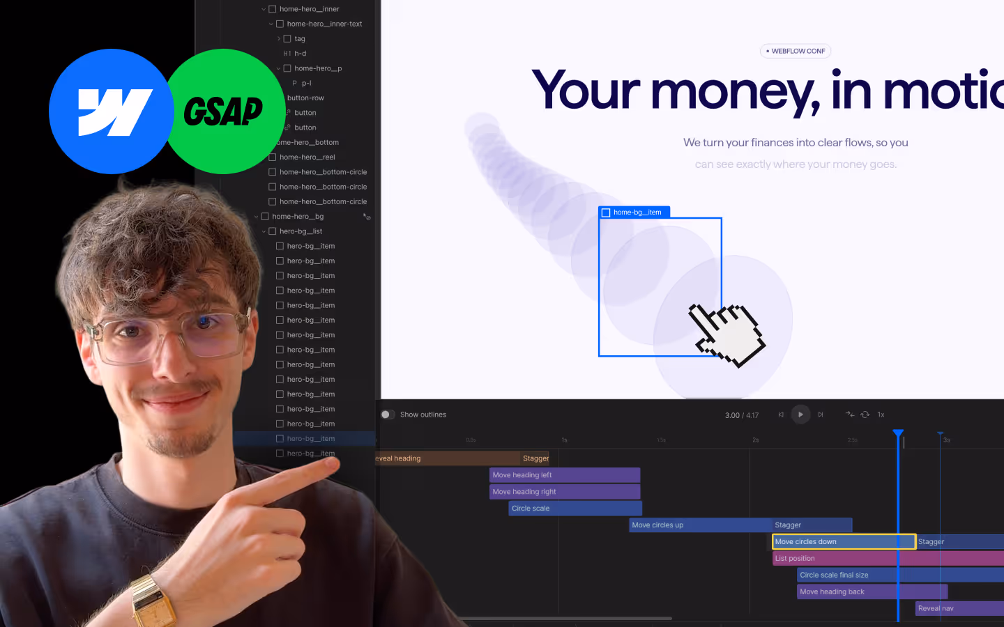
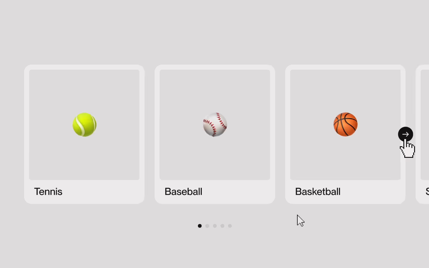
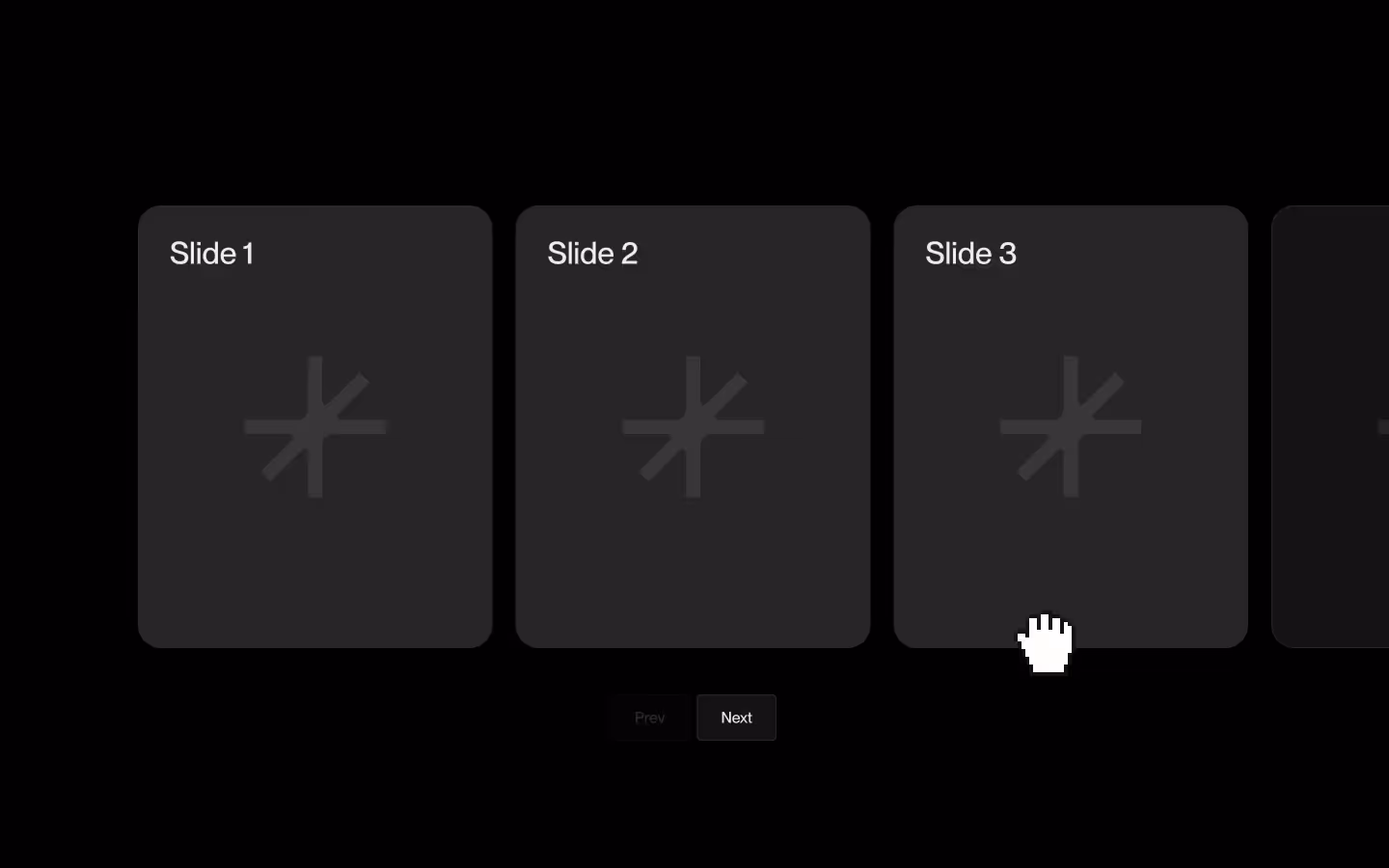
Basic GSAP Slider (Watch CSS)
Documentation
Webflow
Code
Setup: External Scripts
External Scripts in Webflow
Make sure to always put the External Scripts before the Javascript step of the resource.
In this video you learn where to put these in your Webflow project? Or how to include a paid GSAP Club plugin in your project?
HTML
<script src="https://cdn.jsdelivr.net/npm/gsap@3.14.1/dist/gsap.min.js"></script>
<script src="https://cdn.jsdelivr.net/npm/gsap@3.14.1/dist/Draggable.min.js"></script>
<script src="https://cdn.jsdelivr.net/npm/gsap@3.14.1/dist/InertiaPlugin.min.js"></script>
Step 1: Copy structure to Webflow
Copy structure to Webflow
In the video below we described how you can copy + paste the structure of this resource to your Webflow project.
Copy to Webflow
Webflow structure is not required for this resource.
Step 1: Add HTML
HTML
<div aria-label="Slider" data-gsap-slider-init="" role="region" aria-roledescription="carousel" class="gsap-slider">
  <div data-gsap-slider-collection="" class="gsap-slider__collection">
    <div data-gsap-slider-list="" class="gsap-slider__list">
      <!-- Slide 1 -->
      <div data-gsap-slider-item="" class="gsap-slider__item">
        <div class="demo-card">
          <div class="before__125"></div>
          <svg xmlns="http://www.w3.org/2000/svg" width="100%" viewbox="0 0 160 160" fill="none" class="osmo-icon-svg"><path d="M94.8284 53.8578C92.3086 56.3776 88 54.593 88 51.0294V0H72V59.9999C72 66.6273 66.6274 71.9999 60 71.9999H0V87.9999H51.0294C54.5931 87.9999 56.3777 92.3085 53.8579 94.8283L18.3431 130.343L29.6569 141.657L65.1717 106.142C67.684 103.63 71.9745 105.396 72 108.939V160L88.0001 160L88 99.9999C88 93.3725 93.3726 87.9999 100 87.9999H160V71.9999H108.939C105.407 71.9745 103.64 67.7091 106.12 65.1938L106.142 65.1716L141.657 29.6568L130.343 18.3432L94.8284 53.8578Z" fill="currentColor"></path></svg>
          <div class="demo-card__tag"><p class="demo-card__tag-p">Slide 1</p></div>
        </div>
      </div>
      <!-- Slide 2 -->
      <div data-gsap-slider-item="" class="gsap-slider__item">
        <div class="demo-card">
          <div class="before__125"></div>
          <svg xmlns="http://www.w3.org/2000/svg" width="100%" viewbox="0 0 160 160" fill="none" class="osmo-icon-svg"><path d="M94.8284 53.8578C92.3086 56.3776 88 54.593 88 51.0294V0H72V59.9999C72 66.6273 66.6274 71.9999 60 71.9999H0V87.9999H51.0294C54.5931 87.9999 56.3777 92.3085 53.8579 94.8283L18.3431 130.343L29.6569 141.657L65.1717 106.142C67.684 103.63 71.9745 105.396 72 108.939V160L88.0001 160L88 99.9999C88 93.3725 93.3726 87.9999 100 87.9999H160V71.9999H108.939C105.407 71.9745 103.64 67.7091 106.12 65.1938L106.142 65.1716L141.657 29.6568L130.343 18.3432L94.8284 53.8578Z" fill="currentColor"></path></svg>
          <div class="demo-card__tag"><p class="demo-card__tag-p">Slide 2</p></div>
        </div>
      </div>
      <!-- Etc. -->
    </div>
  </div>
  <div data-gsap-slider-controls="" class="gsap-slider__controls">
    <button data-gsap-slider-control="prev" class="gsap-slider__control">Prev</button>
    <button data-gsap-slider-control="next" class="gsap-slider__control">Next</button>
  </div>
</div>
HTML structure is not required for this resource.
Step 2: Add CSS
CSS
.gsap-slider {
  grid-column-gap: 3em;
  grid-row-gap: 3em;
  flex-flow: column;
  align-items: center;
  width: 100%;
  padding-left: 5vw;
  padding-right: 5vw;
  display: flex;
  position: relative;
  overflow: hidden;
}

.gsap-slider__collection {
  width: 100%;
  max-width: 72em;
}

.gsap-slider__list {
  -webkit-user-select: none;
  user-select: none;
  will-change: transform;
  touch-action: pan-y;
  backface-visibility: hidden;
  display: flex;
}

.gsap-slider__item {
  width: calc(((100% - 1px)  - (var(--slider-spv)  - 1) * var(--slider-gap)) / var(--slider-spv));
  margin-right: var(--slider-gap);
  flex: none;
}

.demo-card {
  background-color: #2c2c2c;
  border: 1px solid #2c2c2c;
  border-radius: 1.5em;
  justify-content: center;
  align-items: center;
  width: 100%;
  display: flex;
  position: relative;
  overflow: hidden;
}

.before__125 {
  padding-top: 125%;
}

.osmo-icon-svg {
  opacity: .1;
  width: 40%;
  position: absolute;
}

.demo-card__tag {
  position: absolute;
  top: 2em;
  left: 2em;
}

.demo-card__tag-p {
  margin-bottom: 0;
  font-size: 2em;
  line-height: 1;
}

/* Setup */

[data-gsap-slider-init] {
  --slider-status: on; /* Turn slider on/off */
  --slider-spv: 3; /* Slides per view */
  --slider-gap: 1.5em; /* Slides Gap */
}

@media screen and (max-width: 991px) {
   [data-gsap-slider-init] {
    --slider-status: on; /* Turn slider on/off */
    --slider-spv: 2.25; /* Slides per view */
    --slider-gap: 1.5em; /* Slides Gap */
  }
}

@media screen and (max-width: 767px) {
  [data-gsap-slider-init] {
    --slider-status: on; /* Turn slider on/off */
    --slider-spv: 1.15; /* Slides per view */
    --slider-gap: 1em; /* Gap */
  }
}

[data-gsap-slider-item]:last-child {
  margin-right: 0;
}

/* Controls */

.gsap-slider__controls {
  grid-column-gap: .5em;
  grid-row-gap: .5em;
  justify-content: center;
  align-items: center;
  display: flex;
}

.gsap-slider__control {
  color: #efeeec;
  background-color: #131313;
  border: 1px solid #2c2c2c;
  border-radius: .25em;
  padding: .75em 1.5em;
  font-size: 1em;
}

[data-gsap-slider-status="not-active"] [data-gsap-slider-controls] {
  display: none;
}

[data-gsap-slider-control-status="not-active"] {
  opacity: 0.2;
  pointer-events: none;
}

/* Customization */

.gsap-slider__control {
  transition: opacity 0.3s ease;
}

.demo-card {
  transition: all 0.3s ease;
}

[data-gsap-slider-item-status="not-active"] .demo-card {
  background-color: #131313;
}

.demo-card__tag {
  transition: all 0.3s ease;
}

[data-gsap-slider-item-status="not-active"] .demo-card__tag {
  opacity: 0;
}
Step 2: Add custom Javascript
Custom Javascript in Webflow
In this video, Ilja gives you some guidance about using JavaScript in Webflow:
Step 2: Add Javascript
Step 3: Add Javascript
Javascript
gsap.registerPlugin(Draggable, InertiaPlugin);

function initBasicGSAPSlider() {
  document.querySelectorAll('[data-gsap-slider-init]').forEach(root => {
    if (root._sliderDraggable) root._sliderDraggable.kill();

    const collection = root.querySelector('[data-gsap-slider-collection]');
    const track      = root.querySelector('[data-gsap-slider-list]');
    const items      = Array.from(root.querySelectorAll('[data-gsap-slider-item]'));
    const controls   = Array.from(root.querySelectorAll('[data-gsap-slider-control]'));

    // Inject aria attributes
    root.setAttribute('role','region');
    root.setAttribute('aria-roledescription','carousel');
    root.setAttribute('aria-label','Slider');
    collection.setAttribute('role','group');
    collection.setAttribute('aria-roledescription','Slides List');
    collection.setAttribute('aria-label','Slides');
    items.forEach((slide,i) => {
      slide.setAttribute('role','group');
      slide.setAttribute('aria-roledescription','Slide');
      slide.setAttribute('aria-label',`Slide ${i+1} of ${items.length}`);
      slide.setAttribute('aria-hidden','true');
      slide.setAttribute('aria-selected','false');
      slide.setAttribute('tabindex','-1');
    });
    controls.forEach(btn => {
      const dir = btn.getAttribute('data-gsap-slider-control');
      btn.setAttribute('role','button');
      btn.setAttribute('aria-label', dir==='prev' ? 'Previous Slide' : 'Next Slide');
      btn.disabled = true;
      btn.setAttribute('aria-disabled','true');
    });

    // Determine if slider runs
    const styles      = getComputedStyle(root);
    const statusVar   = styles.getPropertyValue('--slider-status').trim();
    let   spvVar      = parseFloat(styles.getPropertyValue('--slider-spv'));
    const rect        = items[0].getBoundingClientRect();
    const marginRight = parseFloat(getComputedStyle(items[0]).marginRight);
    const slideW      = rect.width + marginRight;
    if (isNaN(spvVar)) {
      spvVar = collection.clientWidth / slideW;
    }
    const spv           = Math.max(1, Math.min(spvVar, items.length));
    const sliderEnabled = statusVar==='on' && spv < items.length;
    root.setAttribute('data-gsap-slider-status', sliderEnabled ? 'active' : 'not-active');

    if (!sliderEnabled) {
      // Teardown when disabled
      track.removeAttribute('style');
      track.onmouseenter = null;
      track.onmouseleave = null;
      track.removeAttribute('data-gsap-slider-list-status');
      root.removeAttribute('role');
      root.removeAttribute('aria-roledescription');
      root.removeAttribute('aria-label');
      collection.removeAttribute('role');
      collection.removeAttribute('aria-roledescription');
      collection.removeAttribute('aria-label');
      items.forEach(slide => {
        slide.removeAttribute('role');
        slide.removeAttribute('aria-roledescription');
        slide.removeAttribute('aria-label');
        slide.removeAttribute('aria-hidden');
        slide.removeAttribute('aria-selected');
        slide.removeAttribute('tabindex');
        slide.removeAttribute('data-gsap-slider-item-status');
      });
      controls.forEach(btn => {
        btn.disabled = false;
        btn.removeAttribute('role');
        btn.removeAttribute('aria-label');
        btn.removeAttribute('aria-disabled');
        btn.removeAttribute('data-gsap-slider-control-status');
      });
      return;
    }

    // Track hover state
    track.onmouseenter = () => {
      track.setAttribute('data-gsap-slider-list-status','grab');
    };
    track.onmouseleave = () => {
      track.removeAttribute('data-gsap-slider-list-status');
    };

    //Ccalculate bounds and snap points
    const vw        = collection.clientWidth;
    const tw        = track.scrollWidth;
    const maxScroll = Math.max(tw - vw, 0);
    const minX      = -maxScroll;
    const maxX      = 0;
    const maxIndex  = maxScroll / slideW;
    const full      = Math.floor(maxIndex);
    const snapPoints = [];
    for (let i = 0; i <= full; i++) {
      snapPoints.push(-i * slideW);
    }
    if (full < maxIndex) {
      snapPoints.push(-maxIndex * slideW);
    }

    let activeIndex    = 0;
    const setX         = gsap.quickSetter(track,'x','px');
    let collectionRect = collection.getBoundingClientRect();

    function updateStatus(x) {
      if (x > maxX || x < minX) {
        return;
      }

      // Clamp and find closest snap
      const calcX = x > maxX ? maxX : (x < minX ? minX : x);
      let closest = snapPoints[0];
      snapPoints.forEach(pt => {
        if (Math.abs(pt - calcX) < Math.abs(closest - calcX)) {
          closest = pt;
        }
      });
      activeIndex = snapPoints.indexOf(closest);

      // Update Slide Attributes
      items.forEach((slide,i) => {
        const r           = slide.getBoundingClientRect();
        const leftEdge    = r.left - collectionRect.left;
        const slideCenter = leftEdge + r.width/2;
        const inView      = slideCenter > 0 && slideCenter < collectionRect.width;
        const status      = i === activeIndex ? 'active' : inView ? 'inview' : 'not-active';

        slide.setAttribute('data-gsap-slider-item-status', status);
        slide.setAttribute('aria-selected',    i === activeIndex ? 'true' : 'false');
        slide.setAttribute('aria-hidden',      inView ? 'false' : 'true');
        slide.setAttribute('tabindex',         i === activeIndex ? '0'    : '-1');
      });

      // Update Controls
      controls.forEach(btn => {
        const dir = btn.getAttribute('data-gsap-slider-control');
        const can = dir === 'prev'
          ? activeIndex > 0
          : activeIndex < snapPoints.length - 1;

        btn.disabled = !can;
        btn.setAttribute('aria-disabled', can ? 'false' : 'true');
        btn.setAttribute('data-gsap-slider-control-status', can ? 'active' : 'not-active');
      });
    }

    controls.forEach(btn => {
      const dir = btn.getAttribute('data-gsap-slider-control');
      btn.addEventListener('click', () => {
        if (btn.disabled) return;
        const delta = dir === 'next' ? 1 : -1;
        const target = activeIndex + delta;
        gsap.to(track, {
          duration: 0.4,
          x: snapPoints[target],
          onUpdate: () => updateStatus(gsap.getProperty(track,'x'))
        });
      });
    });

    // Initialize Draggable
    root._sliderDraggable = Draggable.create(track, {
      type: 'x',
      // cursor: 'inherit',
      // activeCursor: 'inherit',
      inertia: true,
      bounds: {minX, maxX},
      throwResistance: 2000,
      dragResistance: 0.05,
      maxDuration: 0.6,
      minDuration: 0.2,
      edgeResistance: 0.75,
      snap: {x: snapPoints, duration: 0.4},
      onPress() {
        track.setAttribute('data-gsap-slider-list-status','grabbing');
        collectionRect = collection.getBoundingClientRect();
      },
      onDrag() {
        setX(this.x);
        updateStatus(this.x);
      },
      onThrowUpdate() {
        setX(this.x);
        updateStatus(this.x);
      },
      onThrowComplete() {
        setX(this.endX);
        updateStatus(this.endX);
        track.setAttribute('data-gsap-slider-list-status','grab');
      },
      onRelease() {
        setX(this.x);
        updateStatus(this.x);
        track.setAttribute('data-gsap-slider-list-status','grab');
      }
    })[0];

    // Initial state
    setX(0);
    updateStatus(0);
  });
}

// Debouncer: For resizing the window
function debounceOnWidthChange(fn, ms) {
  let last = innerWidth, timer;
  return function(...args) {
    clearTimeout(timer);
    timer = setTimeout(() => {
      if (innerWidth !== last) {
        last = innerWidth;
        fn.apply(this, args);
      }
    }, ms);
  };
}

window.addEventListener('resize', debounceOnWidthChange(initBasicGSAPSlider, 200));

// Initialize Basic GSAP Slider
document.addEventListener('DOMContentLoaded', function() {
  initBasicGSAPSlider();
});
Step 3: Add custom CSS
Step 2: Add custom CSS
Custom CSS in Webflow
Curious about where to put custom CSS in Webflow? Ilja explains it in the below video:
CSS
[data-gsap-slider-init] {
  --slider-status: on; /* Turn slider on/off */
  --slider-spv: 3; /* Slides per view */
  --slider-gap: 1.5em; /* Slides Gap */
}

@media screen and (max-width: 991px) {
   [data-gsap-slider-init] {
    --slider-status: on; /* Turn slider on/off */
    --slider-spv: 2.25; /* Slides per view */
    --slider-gap: 1.5em; /* Slides Gap */
  }
}

@media screen and (max-width: 767px) {
  [data-gsap-slider-init] {
    --slider-status: on; /* Turn slider on/off */
    --slider-spv: 1.15; /* Slides per view */
    --slider-gap: 1em; /* Gap */
  }
}

[data-gsap-slider-item]:last-child {
  margin-right: 0;
}

/* Controls */
[data-gsap-slider-status="not-active"] [data-gsap-slider-controls] {
  display: none;
}

[data-gsap-slider-control-status="not-active"] {
  opacity: 0.2;
  pointer-events: none;
}

/* Customization */

.gsap-slider__control {
  transition: opacity 0.3s ease;
}

.demo-card {
  transition: all 0.3s ease;
}

[data-gsap-slider-item-status="not-active"] .demo-card {
  background-color: #131313;
}

.demo-card__tag {
  transition: all 0.3s ease;
}

[data-gsap-slider-item-status="not-active"] .demo-card__tag {
  opacity: 0;
}
Implementation
Slider Group
Wrap your entire slider in a container bearing the [data-gsap-slider-init] attribute. On initialization, the script will toggle [data-gsap-slider-status="active"] (when sliding is enabled) or "not-active" (when disabled), so you can style or query its current state.
Slider Collection
Immediately inside the slider group, include an element with [data-gsap-slider-collection]. The script treats this as the viewport: it measures its width to determine how many slides are visible and locates the actual track within it.
Slider List
Within the collection, add the drag‐able track element marked with [data-gsap-slider-list]. This is the element that GSAP’s Draggable plugin transforms—everything you swipe or throw is applied to this list.
Slider Slides
Each slide item must carry [data-gsap-slider-item]. As you interact, the script will inject a [data-gsap-slider-item-status] attribute with one of:
- active (the current slide)
- inview (a partially visible slide)
- not-active (completely off‐screen)
Previous/Next Buttons *optional
- Previous Button: An element with
[data-gsap-slider-control="prev"]lets users navigate to the previous slide. The script automatically disables this button when the first slide is active. - Next Button: An element with
[data-gsap-slider-control="next"]lets users navigate to the next slide. This button is disabled when there are no more slides to show—especially considering the number of visible slides. - You can use the
[data-gsap-slider-control-status="active/not-active"]attribute to style the disabled control.
Multiple Sliders
The script supports multiple independent slider instances on the same page: each [data-gsap-slider-init] container is initialized separately so its navigation controls and slide states stay isolated and never conflict with one another.
Accessibility
The slider enhances screen-reader and keyboard support by automatically injecting the appropriate aria roles, properties, and states at runtime.
Responsive Behavior (Watch CSS)
Set slides per view & gap
The number of slides visible at one time is controlled by the CSS custom property var(--slider-spv) on the slider. The gap can be set via var(--slider-gap) variable.
[data-gsap-slider-init] {
  --slider-status: on; /* Turn slider on/off */
  --slider-spv: 3; /* Slides per view */
  --slider-gap: 1.5em; /* Slides Gap */
}
Enable/Disable Slider with CSS
If you want to disable the slider on desktop, and enable on a mobile device you can use the --slider-status: on/off; CSS variable.
[data-gsap-slider-init] {
  --slider-status: off; /* Turn slider on/off */
}

@media screen and (max-width: 767px) {
  [data-gsap-slider-init] {
    --slider-status: on; /* Turn slider on/off */
  }
}Resource details
Last updated
December 16, 2025
Category
Sliders & Marquees
Need help?
Join Slack
Original source
 Dennis Snellenberg
Creator Credits
We always strive to credit creators as accurately as possible. While similar concepts might appear online, we aim to provide proper and respectful attribution.