


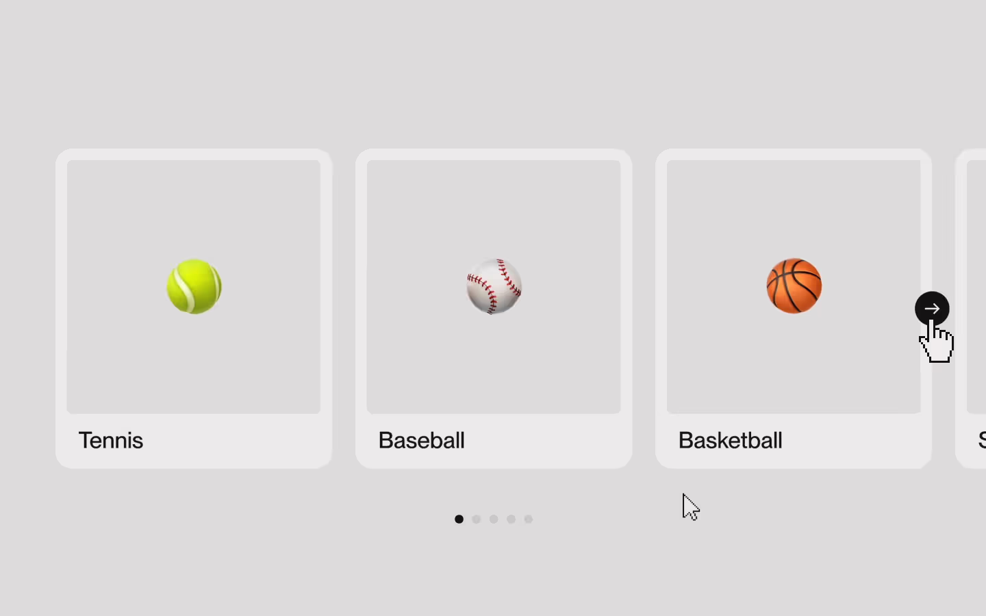
Swiper Slider Setup
Documentation
Webflow
Code
Setup: External Scripts
External Scripts in Webflow
Make sure to always put the External Scripts before the Javascript step of the resource.
In this video you learn where to put these in your Webflow project? Or how to include a paid GSAP Club plugin in your project?
HTML
<!-- CSS -->
<link rel="stylesheet" href="https://cdn.jsdelivr.net/npm/swiper@12/swiper-bundle.min.css"/>

<!-- JS -->
<script src="https://cdn.jsdelivr.net/npm/swiper@12/swiper-bundle.min.js"></script>
Step 1: Copy structure to Webflow
Copy structure to Webflow
In the video below we described how you can copy + paste the structure of this resource to your Webflow project.
Copy to Webflow
Webflow structure is not required for this resource.
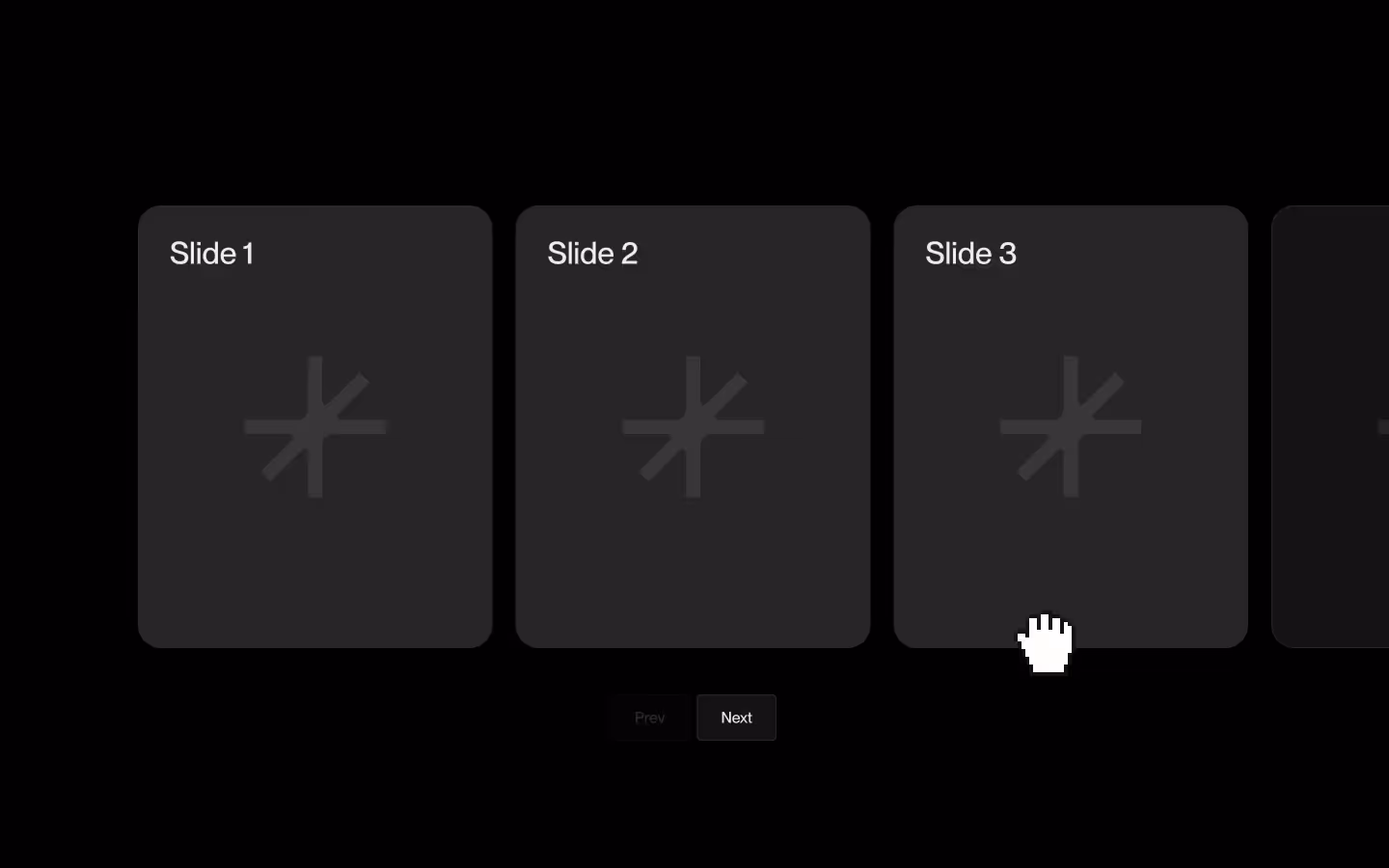
Step 1: Add HTML
HTML
<div data-swiper-group class="swiper-group">
  <div data-swiper-wrap class="swiper">
    <div class="swiper-wrapper">
      <div class="swiper-slide">
        <div class="demo-card">
          <div class="demo-card__visual"></div>
          <div class="demo-card__text"><span class="demo-card__title">Slide 1</span></div>
        </div>
      </div>
      <div class="swiper-slide">
        <div class="demo-card">
          <div class="demo-card__visual"></div>
          <div class="demo-card__text"><span class="demo-card__title">Slide 2</span></div>
        </div>
      </div>
      <div class="swiper-slide">
        <div class="demo-card">
          <div class="demo-card__visual"></div>
          <div class="demo-card__text"><span class="demo-card__title">Slide 3</span></div>
        </div>
      </div>
      <div class="swiper-slide">
        <div class="demo-card">
          <div class="demo-card__visual"></div>
          <div class="demo-card__text"><span class="demo-card__title">Slide 4</span></div>
        </div>
      </div>
      <div class="swiper-slide">
        <div class="demo-card">
          <div class="demo-card__visual"></div>
          <div class="demo-card__text"><span class="demo-card__title">Slide 5</span></div>
        </div>
      </div>
      <div class="swiper-slide">
        <div class="demo-card">
          <div class="demo-card__visual"></div>
          <div class="demo-card__text"><span class="demo-card__title">Slide 6</span></div>
        </div>
      </div>
      <div class="swiper-slide">
        <div class="demo-card">
          <div class="demo-card__visual"></div>
          <div class="demo-card__text"><span class="demo-card__title">Slide 7</span></div>
        </div>
      </div>
    </div>
  </div>
  <div class="swiper-navigation">
    <button data-swiper-prev="" class="swiper-navigation__button">
      <svg xmlns="http://www.w3.org/2000/svg" width="100%" viewbox="0 0 24 24" fill="none" class="swiper-navigation__button-arorw is--prev">
        <path d="M14 19L21 12L14 5" stroke="currentColor" stroke-miterlimit="10" stroke-width="2"></path>
        <path d="M21 12H2" stroke="currentColor" stroke-miterlimit="10" stroke-width="2"></path>
      </svg>
    </button>
    <div class="swiper-pagination"></div>
    <button data-swiper-next="" class="swiper-navigation__button"><svg xmlns="http://www.w3.org/2000/svg" width="100%" viewbox="0 0 24 24" fill="none" class="swiper-navigation__button-arorw">
        <path d="M14 19L21 12L14 5" stroke="currentColor" stroke-miterlimit="10" stroke-width="2"></path>
        <path d="M21 12H2" stroke="currentColor" stroke-miterlimit="10" stroke-width="2"></path>
      </svg>
    </button>
  </div>
</div>
HTML structure is not required for this resource.
Step 2: Add CSS
CSS
body{
  --swiper-pagination-color: currentColor;
  --swiper-pagination-bottom: auto;
  --swiper-pagination-bullet-size: 0.5em;
  --swiper-pagination-bullet-inactive-color: currentColor;
  --swiper-pagination-bullet-inactive-opacity: 0.15;
  --swiper-pagination-bullet-horizontal-gap: 0.25em;
  --swiper-wrapper-transition-timing-function: cubic-bezier(0.625, 0.05, 0, 1);
}

.swiper-group {
  width: 100%;
  position: relative;
}

.swiper {
  flex-flow: row;
  justify-content: flex-start;
  align-items: flex-start;
  width: 100%;
  display: flex;
  overflow: visible !important;
}

.swiper-wrapper {
  flex-flow: row;
  justify-content: flex-start;
  align-items: flex-start;
  width: 100%;
  display: flex;
}

.swiper-slide {
  flex: none;
  max-width: 20em;
  padding-right: 1.25em;
  --gap: 1.25em;
  padding-right: var(--gap);
}

.swiper-slide:last-of-type{
  margin-right: calc(-1 * var(--gap));
}

.swiper-pagination {
  pointer-events: auto;
  z-index: 0 !important;
}

.swiper-navigation {
  z-index: 2;
  pointer-events: none;
  justify-content: space-between;
  align-items: center;
  display: flex;
  position: absolute;
  bottom: 0;
  left: 0;
  right: 0;
  transform: translate(0, 150%);
}

.swiper-navigation__button {
  z-index: 1;
  aspect-ratio: 1;
  pointer-events: auto;
  color: #000;
  background-color: #fff;
  border-radius: 100em;
  justify-content: center;
  align-items: center;
  width: 3em;
  padding: 1em;
  display: flex;
  position: relative;
  transition: opacity 0.2s ease;
}

.swiper-button-disabled{
  opacity: 0;
  pointer-events: none;
}

.swiper-navigation__button-arorw {
  justify-content: center;
  align-items: center;
  width: 100%;
  display: flex;
}

.swiper-navigation__button-arorw.is--prev {
  transform: rotate(-180deg);
}

.demo-card {
  aspect-ratio: 4 / 5.25;
  background-color: #131313;
  border: 1px solid #ffffff26;
  border-radius: 1em;
  flex-flow: column;
  justify-content: space-between;
  align-items: stretch;
  width: 100%;
  padding: 1em;
  display: flex;
}

.demo-card__visual {
  background-color: #ffffff08;
  background-image: linear-gradient(135deg, #ffffff08, #ffffff14 11%, #ffffff08 16%, #ffffff12 58%, #ffffff17 63%, #ffffff08 73%, #ffffff0d 96%, #ffffff08);
  border: 1px solid #ffffff0d;
  border-radius: .5em;
  flex: 1;
}

.demo-card__text {
  padding-top: 1em;
  padding-bottom: .25em;
  padding-left: .5em;
}

.demo-card__title {
  font-size: 1.5em;
}
Step 2: Add custom Javascript
Custom Javascript in Webflow
In this video, Ilja gives you some guidance about using JavaScript in Webflow:
Step 2: Add Javascript
Step 3: Add Javascript
Javascript
function initSwiperSlider() {
  const swiperSliderGroups = document.querySelectorAll("[data-swiper-group]");

  swiperSliderGroups.forEach((swiperGroup) => {
    const swiperSliderWrap = swiperGroup.querySelector("[data-swiper-wrap]");
    if(!swiperSliderWrap) return;

    const prevButton = swiperGroup.querySelector("[data-swiper-prev]");
    const nextButton = swiperGroup.querySelector("[data-swiper-next]");

    const swiper = new Swiper(swiperSliderWrap, {
      slidesPerView: 1.25,
      speed: 600,
      mousewheel: true,
      grabCursor: true,
      breakpoints: {
        // when window width is >= 480px
        480: {
          slidesPerView: 1.8,
        },
        // when window width is >= 992px
        992: {
          slidesPerView: 3.5,
        }
      },
      navigation: {
        nextEl: nextButton,
        prevEl: prevButton,
      },
      pagination: {
        el: '.swiper-pagination',
        type: 'bullets',
        clickable: true
      },
      keyboard: {
        enabled: true,
        onlyInViewport: false,
      },
    });

  });
}

// Initialize Swiper Slider Setup
document.addEventListener('DOMContentLoaded', () => {
  initSwiperSlider();
});
Step 3: Add custom CSS
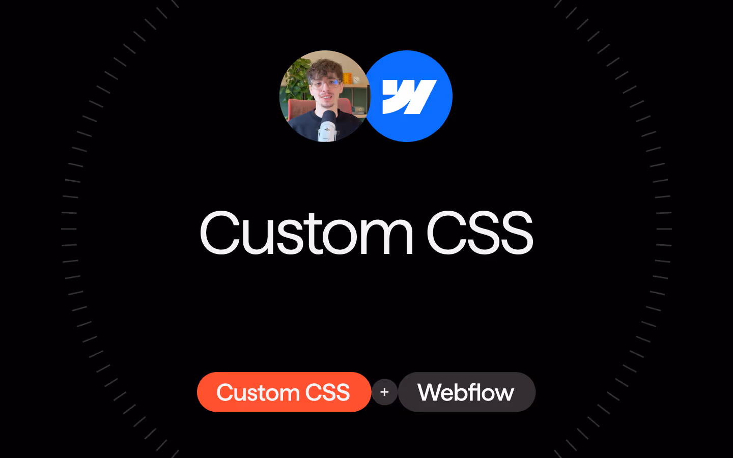
Step 2: Add custom CSS
Custom CSS in Webflow
Curious about where to put custom CSS in Webflow? Ilja explains it in the below video:
CSS
body{
  --swiper-pagination-color: currentColor;
  --swiper-pagination-bottom: auto;
  --swiper-pagination-bullet-size: 0.5em;
  --swiper-pagination-bullet-inactive-color: currentColor;
  --swiper-pagination-bullet-inactive-opacity: 0.15;
  --swiper-pagination-bullet-horizontal-gap: 0.25em;
  --swiper-wrapper-transition-timing-function: cubic-bezier(0.625, 0.05, 0, 1);
}

.swiper-slide{
  --gap: 1.25em;
  padding-right: var(--gap);
}

.swiper-slide:last-of-type{
  margin-right: calc(-1 * var(--gap));
}

.swiper-navigation__button{
  transition: opacity 0.2s ease;
}

.swiper-button-disabled{
  opacity: 0;
  pointer-events: none;
}
Implementation
Introduction
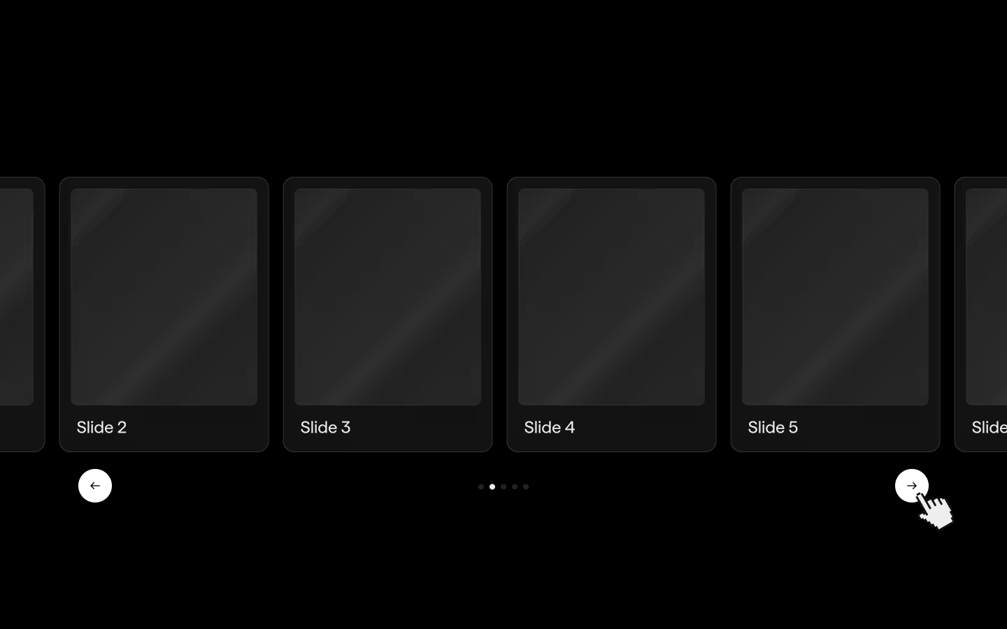
In this resource we'll go over creating a pretty basic slider. Swiper has a massive API with tons of options, so definitely check out the documentation and demo pages for all of the things you can do.
Swiper group
The slider should be wrapped in an element with the attribute [data-swiper-group] on it. This group will hold the slider, and any potential navigation, pagination, etc inside of it.
Swiper
This is the element that we will target for initializing the Swiper slider. Make sure it has a class of .swiper on it, and an attribute of [data-swiper-wrap]. The class is necessary for Swiper to work with its API, the attribute is used for easy targeting in JS.
Swiper wrapper
The direct child of the [data-swiper-wrap] element gets a class of .swiper-wrapper. This doesn't need any further attributes, as it's just the necessary Swiper structure as per the docs.
Swiper slides
Inside of our swiper wrapper, we will have all of the slides. They need a class of .swiper-slide. You can set a max-width on these in CSS if you want. Their actual width is going to be defined in JS.
Slides per view
We define the slides per view in JS, in the options. This structure is kind of in reverse, your 'default' slidesPerView is technically the one for the smallest breakpoint. Then, you can add as few (or many) breakpoints as you want to control how many slides you want on that size:
// default amount of slides per view
slidesPerView: 1.25,
breakpoints: {
  // when window width is >= 480px
  480: {
  slidesPerView: 1.8,
  },
  // when window width is >= 992px
  992: {
  slidesPerView: 3.5,
}
Space between slides
Since Swiper only offers a way to use pixels to define the gap between our slides, we prefer to create that gap by adding some padding-right on our slides. This way you can set it with any CSS unit you like. To make sure the last slide aligns with the end of the container, and there's no extra gap, we apply some negative margin-right, to offset the padding:
.swiper-slide{
  --gap: 1.25em;
  padding-right: var(--gap);
}

.swiper-slide:last-of-type{
  margin-right: calc(-1 * var(--gap));
}
Previous/Next Buttons *optional
Anywhere inside your [data-swiper-group] you can add 2 buttons to control prev/next:
- Previous Button: An element with
[data-swiper-prev]lets users navigate to the previous slide. The script automatically disables this button when the first slide is active. - Next Button: An element with
[data-swiper-next]lets users navigate to the next slide. This button is disabled when there are no more slides to show—especially considering the number of visible slides.
Dots / Pagination *optional
Add a div with the class of .swiper-pagination somewhere in your [data-swiper-group]. When initialized, Swiper will automatically fill it with the correct amount of dots. To control their styling, check out the CSS variables we shared in the CSS. There's more options than we included, so have a look at the docs for more.
Webflow CMS structure
If you're wondering how to create a Swiper slider from a CMS collection, here's what you need:
- CMS collection wrap: give it a class of
.swiperand attribute of[data-swiper-wrap] - CMS collection list: give it a class of
.swiper-wrapper - CMS collection item: give it a class of
.swiper-slide
Resource details
Last updated
December 16, 2025
Category
Sliders & Marquees
Need help?
Join Slack
Original source
 Ilja van Eck
Creator Credits
We always strive to credit creators as accurately as possible. While similar concepts might appear online, we aim to provide proper and respectful attribution.